
BIOAIR — Branding and Digital Brand Experience
Branding • Visual Language • Brand Book
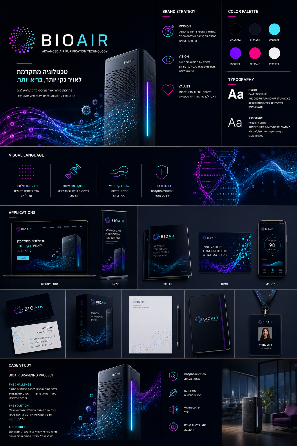
Comprehensive branding for BIOAIR — an advanced air purification technology company. A futuristic visual language emphasizes innovation, science and health. The logo, neon color palette, typography and applications cover every touchpoint.
- Logo, neon color palette and typography (Heebo / Assistant)
- Visual language: DNA waves, particles and line illustrations
- Applications: website, app, packaging, stationery and case study
Case Study
An air-quality brand that feels clean, healthy and technological
1
The Project
Branding and digital brand experience for BIOAIR: logo, visual language and a component system for digital use.
2
My Role
Branding, visual language and component system design
3
The Challenge
A crowded market where every competitor looks alike — differentiation had to work on a small screen first.
4
Process
- Market research and mapping competitor visual languages
- Developing a logo and language around air, breath and cleanliness
- Designing a digital component system
- Applying it across screens, decks and social
5
The Solution
An airy brand language with a clean palette, modern typography and a ready-to-apply component kit.
6
Results
- A consistent brand across all digital assets
- A ready foundation for site and campaigns
- Clear differentiation from competitors