
LevelUp Kitchen — Cooking Learning Dashboard
UI/UX Design • Dashboard • Web App
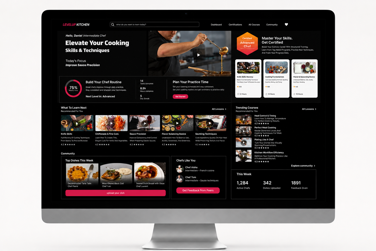
Dashboard interface design for a cooking-learning platform. The main screen shows personal progress, recommended learning paths, trending courses and a chef community. Everything is arranged in a clean, modern and scannable layout.
- Smart widgets for daily progress, cooking routine and practice scheduling
- Clear categorization of courses, lessons and learning tracks
- A dark, focused visual language with high-quality food photography and bold CTAs
Case Study
A cooking-learning dashboard that connects progress, community and professional content
1
The Project
LevelUp Kitchen is an online culinary learning platform aimed at home cooks and food enthusiasts who want to advance in a structured and enjoyable way.
2
My Role
UI/UX Design • Dashboard Design • Web App Design • Figma
3
The Challenge
The challenge was to design a home screen rich with information — personal progress, courses, lessons, community and practice scheduling — without creating visual clutter that confuses the user.
4
Users
- Home cooks — looking for clear learning paths and a sense of progress
- Food enthusiasts — want to discover new courses and connect with a community
5
UX Process
- 1Central widgetsDefining clear widgets for progress, daily routine and practice scheduling.
- 2Modular hierarchyDividing content into separate modules that are easy to scan and navigate.
- 3Clear categorizationOrganizing courses and lessons by topic, level and study time.
- 4Community and engagementIncluding a community area that encourages sharing, feedback and positive competition.
- 5Bold CTAsCentral action buttons that lead the user to continue learning.
6
The Solution
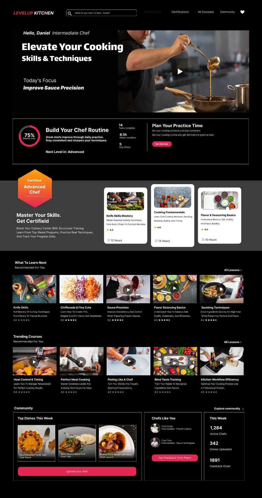
We designed a dark, focused dashboard with a dark palette that directs attention to the food photography and content. The progress widget provides immediate motivation, while the course and community areas are organized in a clean composition that makes quick scanning easy.
7
Design System
- Dark palette with high contrast for food photography
- Cards with rounded corners and soft shadows
- Clean, readable typography in hierarchical sizes
- Minimal icons and visual indicators
- Bold pink action buttons on a dark background
- Flexible grid that adapts to desktop and tablet
8
Final Screens
The main dashboard combines all the important platform components: progress overview, recommended courses, trending lessons, community and engagement options — all in one clear view.
9
Results
- A home screen that lets users see their status and continue learning with one click
- A consistent design language suited to culinary and professional content
- A user experience that encourages daily engagement and long-term progress
10